How can I describe this data using a graph?
Earth ScienceA graph is a graphical representation of data. Visualizing data through graphs helps to detect patterns, trends, relationships, and structures in data. Use graphs in conjunction with maps to explore data or help tell a story.
Graphs can be created from both tabular and raster data, and there is a different set of graphs for each type of data. Tabular data refers to entity or vector data, as well as stand-alone tables. Raster data refers to image or pixel-based data.
Why use charts and graphs
Many presentations focus on data and numbers. Sounds boring, doesn’t it? But charts and graphs can help grab your audience’s attention. Add them to your presentation and you have an in-depth, fact-based presentation.
When it comes to presenting and explaining data in charts and graphs, you need to help listeners understand and remember at least the main points. As for usage: charts and other visual information are great for describing trends, making comparisons, or showing relationships between two or more items. In other words, you use data and give it a visually comprehensible form.
What’s the best choice
There are many different types of charts and graphs, which leads to the difficulty of choosing the most appropriate options. The chart parameters in the program you use can also be very puzzling.
When should you use flowcharts? Should you use a chart to show trends? Are bar charts useful for displaying sales data? Understanding the specifics of each type is required so you can choose the right one.
The rest of this article is devoted to breaking down examples of different types of visual elements and will explain in detail how to describe graphs and charts.
Charts and graphs
Data can be presented in different ways. The 4 main types of charts are: bar chart, line chart, pie chart, and simple chart.
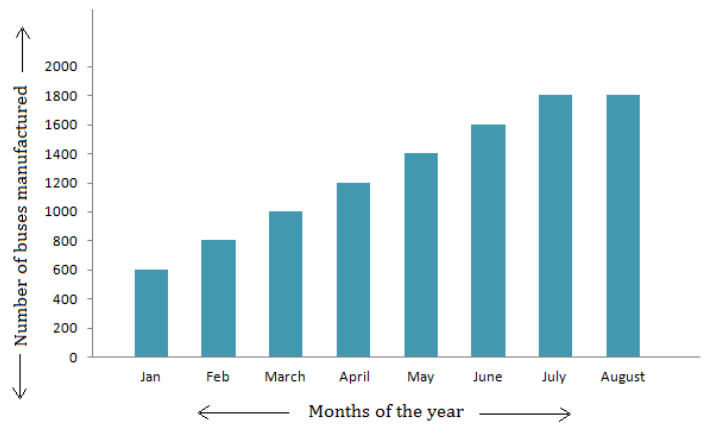
Bar charts are used to show relationships between different data that do not depend on each other. In this case, the height or length of the bar indicates a certain value or frequency. Below you can see an example of a bar chart, which is the most common chart for displaying statistical data.
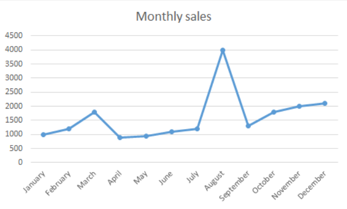
Line charts show changes in data over time. This type of chart is especially useful when you want to show interrelated trends or numbers (for example: how sales change over one year). In addition, line charts can be useful when showing the relationship between two objects over a period of time.
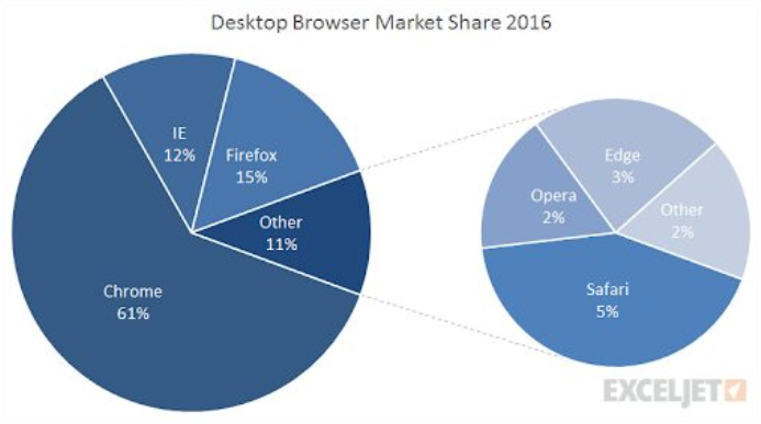
Pie charts are designed to visualize how a whole is divided into parts. All segments of a pie chart are part of the overall data set and thus show the percentage distribution.
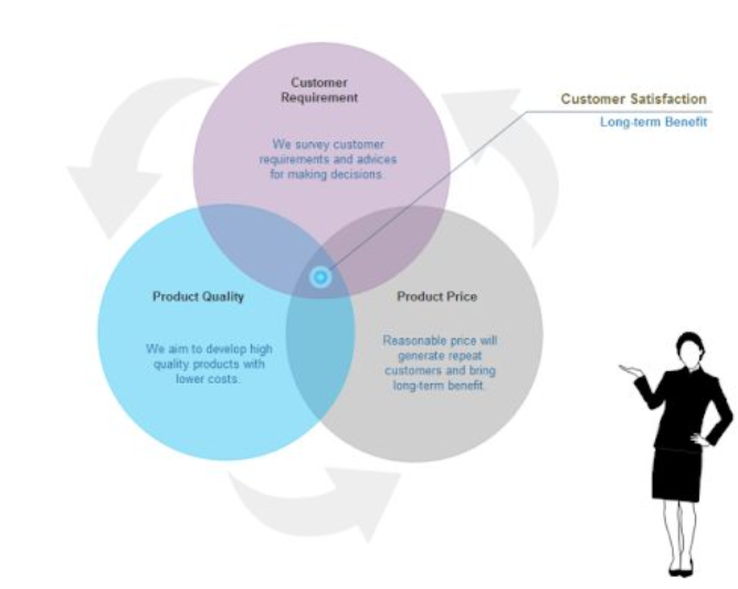
A diagram is a plan, drawing, or diagram that illustrates the relationship between different parts and overlaps at certain points.
How to Start Describing
Once you’ve made a fascinating chart or graph for your presentation, it’s time to learn how to describe them properly. Use the following phrases to get your audience’s attention right away:
- Let me show you this bar graph…
- Let’s turn to this diagram…
- I’d like you to look at this map…
- If you look at this graph, you will notice…
- Let’s have a look at this pie chart…
- If you look at this line chart, you will understand…
- To illustrate my point, let’s look at some charts…
How to describe diagrams and other visual effects: naming elements
To describe charts or any other types of charts, you must name all the visual elements. For example:
- The vertical axis shows…
- The horizontal axis represents…
- This curve illustrates…
- The solid line shows…
- The shaded area describes…
- This colored segment is for…
- The red bar…
How to Describe Bar Charts
Bar charts convert data to columns. Typically, such charts show something on the X-axis and numbers on the Y-axis. This way, you can compare statistical data from different groups.
Bar charts show which category is the largest and which is the smallest. Each group must be independent so that making changes will not affect the remaining information. Columns can be displayed either vertically or horizontally, as this does not affect the information.
The words used to describe bar charts are very similar to those used to describe line charts.
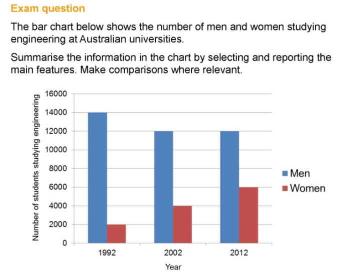
Here is an excellent example of a bar chart description prepared by the British Council as an answer to the question posed. You can also use the following vocabulary to talk about the bar graphs used in the presentation:
How to describe line charts
Now that you already know how to describe bar charts, let’s move on to describing line charts. This type of chart converts information into line-connected points on a grid, which shows trends, changes, or relationships between objects, numbers, dates, and other data. These lines show changes over a period of time and the influence of key factors.
You should use appropriate verbs, adjectives, and adverbs to describe line changes, depending on what you want to emphasize. To do this, use the following vocabulary:
Verbs: rise, increase, grow, go up to, climb, boom, peak, fall, decline, decrease, drop, dip, go down, reduce, level up, remain stable, no change, remain steady, stay constant, stay, maintain the same level, crash, collapse, plunge, plummet.
Adjectives: sharp, rapid, huge, dramatic, substantial, considerable, significant, slight, small, minimal, massive.
Adverbs: dramatically, rapidly, hugely, massive, sharply, steeply, considerably, substantially, significantly, slightly, minimally, markedly.
There is also a list of adverbs describing the speed of change: rapidly, quickly, swiftly, suddenly, steadily, gradually, slowly.
How to describe pie charts
Pie charts are mostly used to show how different parts make up a whole. The best way to represent data in a pie chart is to compare categories to each other. Check out the list of comparisons below:
- to compare
- compared to
- as opposed to
- versus
- more than
- the majority of
- only a small monitory
- greater than
- less than
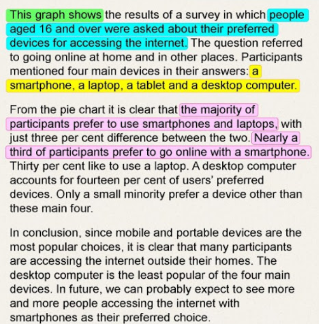
Here’s an example of a pie chart showing which device Internet users over the age of 16 prefer to browse the web on:
This example demonstrates the best way to summarize data:
Before you start creating diagrams for your presentation, decide exactly what data you plan to display and then create diagrams for your audience. Create simple diagrams. Charts and graphs should be clear. Use the various words and synonyms mentioned in this article to describe the charts and help your listeners understand the importance of your data.
Quickly improve your English language skills with new information and inspiration from professional tutors. Just subscribe and get helpful tips every week.
How do you describe data from a graph?
A line graph plots data in a single line over time. To describe the graph, follow it’s progress along the horizontal access and describe whether it goes down, up, or stays the same.
What are ways to describe a graph?
For example, the axes are represented by solid thick lines. A second way to describe a graph is writing an alternate text (alt text). Alternate text conveys the information of a graph such as the title of the graph, the type of graph, the axes, and the trend of the graph which is read aloud by a screen reader.
How do you describe data?
Descriptive comes from the word ‘describe’ and so it typically means to describe something. Descriptive statistics is essentially describing the data through methods such as graphical representations, measures of central tendency and measures of variability.
Is a graph a description of data?
What is a Graph? In math, a graph can be defined as a pictorial representation or a diagram that represents data or values in an organized manner. The points on the graph often represent the relationship between two or more things.
How do you write a report to describe a graph?
Writing about Graphs: Overview
- Underline key words. Write related words – turn nouns into verbs, verbs into nouns, adjectives into adverbs, etc. …
- Circle and highlight the graph. Use arrows. …
- Identify trends. A trend is the overall idea of the graph.
- While You Write: Some Don’ts.
How do you describe a line graph in English?
A line graph—also known as a line plot or a line chart—is a graph that uses lines to connect individual data points. A line graph displays quantitative values over a specified time interval. In finance, line graphs are commonly used to depict the historical price action of an asset or security.
How do you describe a bar graph example?
A bar chart is a graph with rectangular bars. The graph usually compares different categories. Although the graphs can be plotted vertically (bars standing up) or horizontally (bars laying flat from left to right), the most usual type of bar graph is vertical.
How do you describe a graph that goes up and down?
Small changes up and down are called ‘fluctuations’.
Line Graphs.
| increase | decrease |
|---|---|
| climb | drop |
| develop | fall |
How do you describe data in a study?
What to include
- details of the equipment used, such as the make and model of the instrument, the settings used, information on how it was calibrated.
- the text of survey instruments used, including questionnaires and interview templates.
- details of who collected the data and when.
How do you describe a sample?
A sample is an unbiased number of observations taken from a population. In simple terms, a population is the total number of observations (i.e., individuals, animals, items, data, etc.) contained in a given group or context.
Why do we need to describe data?
Describing your data
The main goal of any statistics is to condense data into easy to understand summaries. Being able to effectively describe your data will open up your data set to a wider audience. Also it will allow you to more easily conduct analysis.
How do you write an essay on a graph?
Here is the 5 steps process I recommend for planning and writing IELTS line graph essays:
- Analyse the question.
- Identify the main features.
- Write an introduction.
- Write an overview.
- Write the details paragraphs.
How do you describe data in a report?
What to include
- details of the equipment used, such as the make and model of the instrument, the settings used, information on how it was calibrated.
- the text of survey instruments used, including questionnaires and interview templates.
- details of who collected the data and when.
How do you describe a line graph in statistics?
A line chart is a visual comparison of how two variables—shown on the x- and y-axes—are related or vary with each other. It shows related information by drawing a continuous line between all the points on a grid.
How do you describe the distribution of data?
When examining the distribution of a quantitative variable, one should describe the overall pattern of the data (shape, center, spread), and any deviations from the pattern (outliers).
How do you describe a graph that goes up and down?
Small changes up and down are called ‘fluctuations’.
Line Graphs.
| increase | decrease |
|---|---|
| climb | drop |
| develop | fall |
How do you describe a graph in an essay?
General Guidelines
- Keep the description as short as possible.
- Consider both the content and the function of the figure. …
- Make the first sentence a ‘title’ less than 125 characters long.
- Go from general to more specific details.
- Use the same writing style and terminology as the main text.
How do you describe a bar graph example?
A bar chart is a graph with rectangular bars. The graph usually compares different categories. Although the graphs can be plotted vertically (bars standing up) or horizontally (bars laying flat from left to right), the most usual type of bar graph is vertical.